CSS如何实现圆形进度栏 CSS实现圆形进度栏代码示例
作者:袖梨
2021-04-09
CSS如何实现圆形进度栏?本篇文章小编给大家分享一下CSS实现圆形进度栏代码示例,文章代码介绍的很详细,小编觉得挺不错的,现在分享给大家供大家参考,有需要的小伙伴们可以来看看。
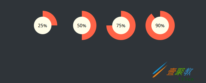
实现效果
实现代码
html
@import url(https://fonts.googleapis.com/css?family=Noto+Sans);
body {
  padding: 30px 0;
  background-color: #2f3439;
  font-family: "Noto Sans", sans-serif;
}

.wrap {

  margin: 0 auto;
}

/* -------------------------------------
 * Bar container
 * ------------------------------------- */
.progress-radial {
  float: left;
  margin-right: 30px;
  position: relative;


  border-radius: 50%;
  border: 2px solid #2f3439;
  background-color: tomato;
}

/* -------------------------------------
 * Optional centered circle w/text
 * ------------------------------------- */
.progress-radial .overlay {
  position: absolute;


  background-color: #fffde8;
  border-radius: 50%;
  margin-left: 20px;
  margin-top: 20px;
  text-align: center;
  line-
  font-size: 16px;
}

/* -------------------------------------
 * Mixin for progress-% class
 * ------------------------------------- */
.progress-0 {
  background-image: linear-gradient(90deg, #2f3439 50%, rgba(0, 0, 0, 0) 50%, rgba(0, 0, 0, 0)), linear-gradient(90deg, #ff6347 50%, #2f3439 50%, #2f3439);
}

.progress-5 {
  background-image: linear-gradient(90deg, #2f3439 50%, rgba(0, 0, 0, 0) 50%, rgba(0, 0, 0, 0)), linear-gradient(108deg, #ff6347 50%, #2f3439 50%, #2f3439);
}

.progress-10 {
  background-image: linear-gradient(90deg, #2f3439 50%, rgba(0, 0, 0, 0) 50%, rgba(0, 0, 0, 0)), linear-gradient(126deg, #ff6347 50%, #2f3439 50%, #2f3439);
}

.progress-15 {
  background-image: linear-gradient(90deg, #2f3439 50%, rgba(0, 0, 0, 0) 50%, rgba(0, 0, 0, 0)), linear-gradient(144deg, #ff6347 50%, #2f3439 50%, #2f3439);
}

.progress-20 {
  background-image: linear-gradient(90deg, #2f3439 50%, rgba(0, 0, 0, 0) 50%, rgba(0, 0, 0, 0)), linear-gradient(162deg, #ff6347 50%, #2f3439 50%, #2f3439);
}

.progress-25 {
  background-image: linear-gradient(90deg, #2f3439 50%, rgba(0, 0, 0, 0) 50%, rgba(0, 0, 0, 0)), linear-gradient(180deg, #ff6347 50%, #2f3439 50%, #2f3439);
}

.progress-30 {
  background-image: linear-gradient(90deg, #2f3439 50%, rgba(0, 0, 0, 0) 50%, rgba(0, 0, 0, 0)), linear-gradient(198deg, #ff6347 50%, #2f3439 50%, #2f3439);
}

.progress-35 {
  background-image: linear-gradient(90deg, #2f3439 50%, rgba(0, 0, 0, 0) 50%, rgba(0, 0, 0, 0)), linear-gradient(216deg, #ff6347 50%, #2f3439 50%, #2f3439);
}

.progress-40 {
  background-image: linear-gradient(90deg, #2f3439 50%, rgba(0, 0, 0, 0) 50%, rgba(0, 0, 0, 0)), linear-gradient(234deg, #ff6347 50%, #2f3439 50%, #2f3439);
}

.progress-45 {
  background-image: linear-gradient(90deg, #2f3439 50%, rgba(0, 0, 0, 0) 50%, rgba(0, 0, 0, 0)), linear-gradient(252deg, #ff6347 50%, #2f3439 50%, #2f3439);
}

.progress-50 {
  background-image: linear-gradient(-90deg, #ff6347 50%, rgba(0, 0, 0, 0) 50%, rgba(0, 0, 0, 0)), linear-gradient(270deg, #ff6347 50%, #2f3439 50%, #2f3439);
}

.progress-55 {
  background-image: linear-gradient(-72deg, #ff6347 50%, rgba(0, 0, 0, 0) 50%, rgba(0, 0, 0, 0)), linear-gradient(270deg, #ff6347 50%, #2f3439 50%, #2f3439);
}

.progress-60 {
  background-image: linear-gradient(-54deg, #ff6347 50%, rgba(0, 0, 0, 0) 50%, rgba(0, 0, 0, 0)), linear-gradient(270deg, #ff6347 50%, #2f3439 50%, #2f3439);
}

.progress-65 {
  background-image: linear-gradient(-36deg, #ff6347 50%, rgba(0, 0, 0, 0) 50%, rgba(0, 0, 0, 0)), linear-gradient(270deg, #ff6347 50%, #2f3439 50%, #2f3439);
}

.progress-70 {
  background-image: linear-gradient(-18deg, #ff6347 50%, rgba(0, 0, 0, 0) 50%, rgba(0, 0, 0, 0)), linear-gradient(270deg, #ff6347 50%, #2f3439 50%, #2f3439);
}

.progress-75 {
  background-image: linear-gradient(0deg, #ff6347 50%, rgba(0, 0, 0, 0) 50%, rgba(0, 0, 0, 0)), linear-gradient(270deg, #ff6347 50%, #2f3439 50%, #2f3439);
}

.progress-80 {
  background-image: linear-gradient(18deg, #ff6347 50%, rgba(0, 0, 0, 0) 50%, rgba(0, 0, 0, 0)), linear-gradient(270deg, #ff6347 50%, #2f3439 50%, #2f3439);
}

.progress-85 {
  background-image: linear-gradient(36deg, #ff6347 50%, rgba(0, 0, 0, 0) 50%, rgba(0, 0, 0, 0)), linear-gradient(270deg, #ff6347 50%, #2f3439 50%, #2f3439);
}

.progress-90 {
  background-image: linear-gradient(54deg, #ff6347 50%, rgba(0, 0, 0, 0) 50%, rgba(0, 0, 0, 0)), linear-gradient(270deg, #ff6347 50%, #2f3439 50%, #2f3439);
}

.progress-95 {
  background-image: linear-gradient(72deg, #ff6347 50%, rgba(0, 0, 0, 0) 50%, rgba(0, 0, 0, 0)), linear-gradient(270deg, #ff6347 50%, #2f3439 50%, #2f3439);
}

.progress-100 {
  background-image: linear-gradient(90deg, #ff6347 50%, rgba(0, 0, 0, 0) 50%, rgba(0, 0, 0, 0)), linear-gradient(270deg, #ff6347 50%, #2f3439 50%, #2f3439);
}